
Improve link legibility by increasing text-underline-offset
TL;DR
While today’s major browsers (Chrome/Safari/Edge/Firefox/) natively style <a> elements with text-decoration-skip-ink:auto, consider tweaking your CSS to override it. Depending on the combo of certain words and what font they’re set in, the default styles can decrease your link legibility.
Please explain
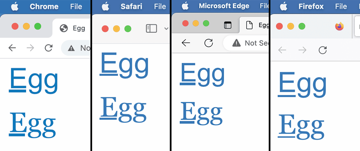
A common example of this issue is the word “egg.” With the stock text-decoration-skip-ink style, only the letter “e” gets underlined, and it can become even more affected by what typeface “egg” is set in.
Yes, but
Yes, egg is an extremely specific use case, but it still can serve as a reason to tweak your <a> underlines. This argument isn’t for the sake of whenever you type egg, but rather as a principle of promoting good typography on the web.
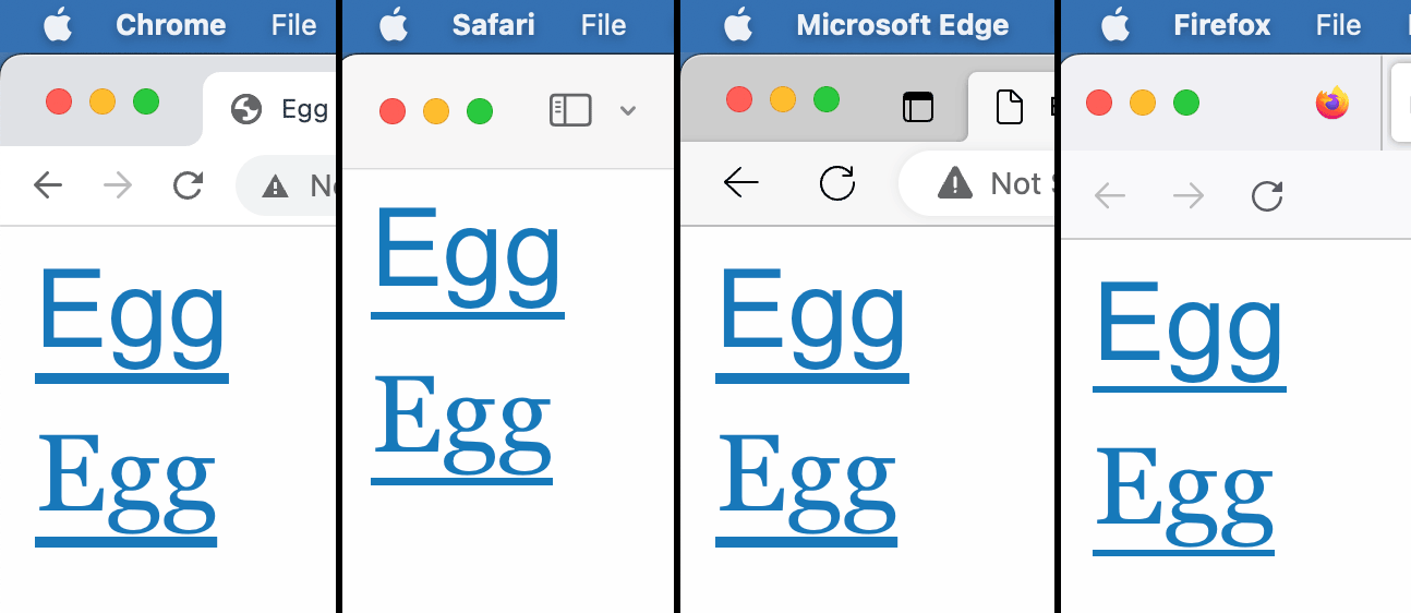
Enter text-underline-offset
By using the CSS rule text-underline-offset, you can bump the underline lower so that it sits below any descenders. Be sure to specify the distance in ems/rems though.
When initially implementing this on my website, I measured it in 4px. Apart from headings, most of the text on this blog computes from rems to between 16px or 18px, so the fixed 4px distance works great for any descenders. It wasn’t until I was playing around with Chrome’s default font size though that I realized the static measurement was resulting in poor layout issues. This is because the font-size is set in rems.
With an increased default browser font-size, my beautiful underlines were suddenly cutting through the glyphs at inconsistent levels below words. A quick swap from px to rems for text-underline-offset fixed the issue.
text-underline-offsetBonus round
You can also combine text-underline-offset with text-decoration-thickness for even more refinement of your <a> styles. In this example of “Egg,” the text-decoration-thickness on the left column is set to 3px, and the right column is auto.
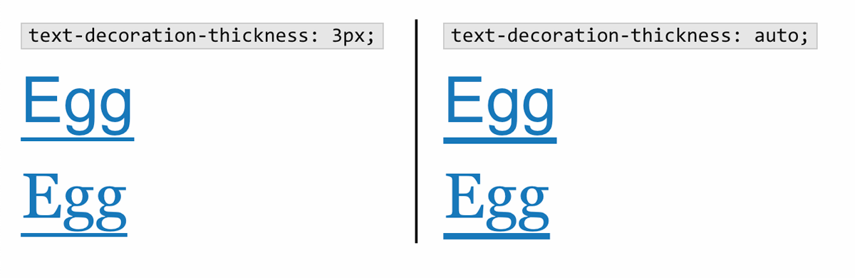
3px and auto text-decoration-thickness as rendered in ChromeOne thing to keep in mind is every browser’s auto value for text-decoration-thickness varies, so that could be another reason to specify the thickness if you’re wanting consistent browser design.
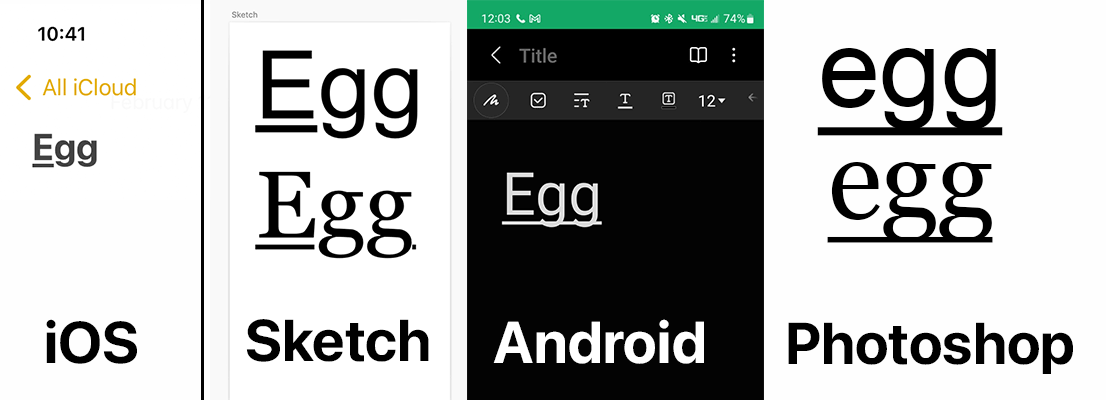
Something interesting to note
iOS and Sketch also emulate text-decoration-skip-ink:auto on underlined text, but Android and Photoshop don’t.
All in all
Maybe you don’t have such granular control of your website’s CSS, or maybe it isn’t a big deal to you, let alone to your client. If the paying client is only concerned about their ROI, then no, this is completely trivial. If you take pleasure in helping to spread high quality typography on the internet as a web developer though, I think it’s still a fun detail to tweak on your passion projects.